Withe the advent of Code Interpreter (which allows ChatGPT 4 to run python code within its environment) you can make use of all the great drawing tools and just tell the system what you want.
Let’s start out with a tweet I made a while back that went viral on all things Covid and our current financial prediciments:
Hello, AI is a reader-supported publication. To receive new posts and support my work, consider becoming a free or paid subscriber.
What if I could reuse this and make a chart out of it for a visual?
I’ve shared the entire conversation here but here are some highlights:
Me:
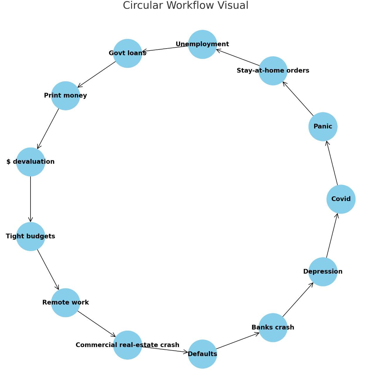
Can you make me a circular workflow visual using these steps in a line?
ChatGPT 4:
Sure, I can help you create a circular workflow visual with these steps. I'll use networkx and matplotlib libraries in Python to create this diagram. These libraries allow us to create and draw graphs respectively.
Let's proceed to create the graph.
import matplotlib.pyplot as plt
import networkx as nx

# Create a directed graph
G = nx.DiGraph()

# List of nodes in the workflow
nodes = [
    "Covid",
    "Panic",
    "Stay-at-home orders",
    "Unemployment",
    "Govt loans",
    "Print money",
    "$ devaluation",
    "Tight budgets",
    "Remote work",
    "Commercial real-estate crash",
    "Defaults",
    "Banks crash",
    "Depression",
]

# Add edges between nodes to create the workflow
for i in range(len(nodes)):
    if i == len(nodes) - 1:  # if we're at the last node, loop back to the first
        G.add_edge(nodes[i], nodes[0])
    else:
        G.add_edge(nodes[i], nodes[i + 1])

# Create the circular layout
pos = nx.circular_layout(G)

# Draw the graph
plt.figure(figsize=(10, 10))
nx.draw(G, pos, with_labels=True, node_color='skyblue', node_size=3000, font_size=12, font_weight='bold', arrowstyle='->', arrowsize=20)
plt.title('Circular Workflow Visual', fontsize=20)
plt.show()
After some fine-tuning and word changes (just by asking) I was able to add a title in the middle:
Me:
2X that size in font!
ChatGPT 4:
Sure, I can further increase the font size of the text in the middle of the circle. Let's double it from 20 to 40 and redraw the graph.
I probably could have done this in PPT but I love just dictating what I want to a program and letting it do it’s thing!
Hello, AI is a reader-supported publication. To receive new posts and support my work, consider becoming a free or paid subscriber.